WebeRacing

WebeRacing

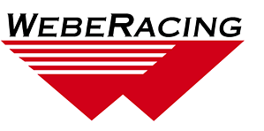
ARCA racing team WebeRacing needed a high-visibility logo for its primary car, one that would be easy to prepare on a computer-driven vinyl cutter. B Plus C Communications produced a design that highlights the “W” in the team’s name (also the last initial of its driver) with a look that says “speed.”

Annual Appeal cards

Crown Hill Heritage Foundation

The third-largest non-governmental cemetery in the United States occupies 555 acres in the heart of Indianapolis. Founded in 1863 as a not-for-profit institution, Crown Hill Cemetery relies on its Heritage Foundation, also not for profit, to preserve and restore the historic treasures on its grounds. The Heritage Foundation calls on B Plus C Communications for … Continued …

Lee R. Ford

Lee R. Ford & Associates

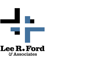
When the accounting firm of Lee R. Ford & Associates wanted a new logo, B Plus C Communications created a two-color identity design featuring a trio of interlocking plus signs, symbolizing the mathematical underpinnings of the firm’s practice. An optical illusion produces one of the plus signs out of the void between the other two, … Continued …

Master Plan outreach

Crown Hill Heritage Foundation

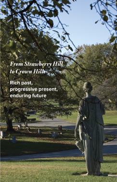
Crown Hill Cemetery embarked on a Master Plan to support this historic not-for-profit institution’s restoration, preservation, and community-partnership needs. Following up on the opportunities and challenges of this document, the Crown Hill Heritage Foundation used direct mail to reach its donor audience with a message about the cemetery’s origins. Titled “From Strawberry Hill to Crown … Continued …

Automotive Sales Training Systems

Automotive Sales Training Systems

Automotive Sales Training Systems teaches vehicle salespeople to understand the needs and psychology of prospective buyers, creating the kind of trust that can guide transactions—and careers—to success. Less-effective but more-common training methods lead to sales-staff turnover, a widespread problem in the industry. After one year, ASTS graduates remain on the job at more than twice … Continued …

Arts & Sciences

Arts & Sciences

For a technology-oriented company that specialized in providing computer systems and services for the graphic arts, B Plus C Communications created a typographic logo that matched up precisely geometric letter forms with a swirling, graceful ampersand. The combination of hard-edged and curved shapes echoed the focus of the client’s business, aptly named for its products … Continued …

Phoenix Theatre digital illustrations

Phoenix Theatre

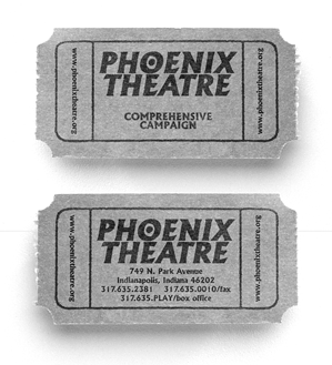
Renowned for staging plays that tackle sensitive themes and subject matter, the Phoenix Theatre is one of only a few Actors Equity member institutions in Indiana. For the covers of a fundraising brochure designed to assist the Phoenix in renovating its facility and meeting other fiscal needs, B Plus C Communications created a pair of … Continued …