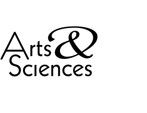
For a technology-oriented company that specialized in providing computer systems and services for the graphic arts, B Plus C Communications created a typographic logo that matched up precisely geometric letter forms with a swirling, graceful ampersand. The combination of hard-edged and curved shapes echoed the focus of the client’s business, aptly named for its products and its customers.
Arts & Sciences

