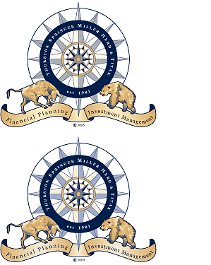
B Plus C Communications analyzed our client Thurston Springer’s logo, which required either four or five spot colors to print, including light gold, dark gold, dark blue, black, and an opaque white ink behind it when it appeared on dark backgrounds. We knew we could lower our client’s printing costs by reducing the number of colors required to render the logo, but the challenge lay in doing so without altering the appearance of shaded and outlined elements.
To achieve our objective, B Plus C Communications replaced the light gold with a tint of the dark-gold ink, and set the black type and compass elements in the dark blue. Compare the two versions for yourself: original above, two-color version below.
Thurston Springer logo revision