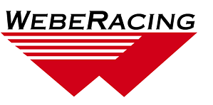
Lee R. Ford

Lee R. Ford & Associates

When the accounting firm of Lee R. Ford & Associates wanted a new logo, B Plus C Communications created a two-color identity design featuring a trio of interlocking plus signs, symbolizing the mathematical underpinnings of the firm’s practice. An optical illusion produces one of the plus signs out of the void between the other two, … Continued …

Tangram (formerly Independent Residential Living of Central Indiana)

Tangram

Independent Residential Living of Central Indiana sought to rebrand itself with an identity that more closely reflected how its services and mission had evolved since it was founded. The not-for-profit organization chose Tangram, naming itself after a classic puzzle that challenges you to build shapes out of a set of seven geometric forms, including five … Continued …

Congressional Choice

Congressional Choice

At the same time that Indiana educational trends pointed to rising high school dropout rates, many Hoosier college students who wanted to pursue teaching careers sought other opportunities because of the widening gap between teacher pay and the compensation in other professions. The Congressional Choice for Educational Excellence scholarship program was designed to help would-be … Continued …

Uneeda Audio

Uneeda Audio

An audio electronics guru wanted a logo for his consulting business, named after an old-school cookie product. B Plus C Communications created a design that plays off the fact that the same letter ends the first and begins the second word of the name. The look also captures the two-sided nature of our client’s business, … Continued …