Lee R. Ford

Lee R. Ford & Associates

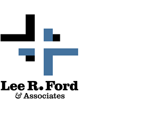
When the accounting firm of Lee R. Ford & Associates wanted a new logo, B Plus C Communications created a two-color identity design featuring a trio of interlocking plus signs, symbolizing the mathematical underpinnings of the firm’s practice. An optical illusion produces one of the plus signs out of the void between the other two, … Continued …

Undon’t

Undont

Because of the importance of building an online presence, naming a new company means creating an identity that hasn’t already been registered as a domain name, which explains some of the (in our humble opinion) downright goofy and contrived names that pop up. For a tech-tutorial website concept focused on graphics software, B Plus C … Continued …

On Your Level Youth Project

On Your Level Youth Project

Through media, multimedia, and in-person experiences aimed at teen audiences, On Your Level Youth Project promotes communication and understanding in a diverse world. B Plus C Communications created a logo that symbolizes the not-for-profit group’s message of bridging gaps among genders, races, and belief systems.

Congressional Choice

Congressional Choice

At the same time that Indiana educational trends pointed to rising high school dropout rates, many Hoosier college students who wanted to pursue teaching careers sought other opportunities because of the widening gap between teacher pay and the compensation in other professions. The Congressional Choice for Educational Excellence scholarship program was designed to help would-be … Continued …

WebeRacing

WebeRacing

ARCA racing team WebeRacing needed a high-visibility logo for its primary car, one that would be easy to prepare on a computer-driven vinyl cutter. B Plus C Communications produced a design that highlights the “W” in the team’s name (also the last initial of its driver) with a look that says “speed.”

Arts & Sciences

Arts & Sciences

For a technology-oriented company that specialized in providing computer systems and services for the graphic arts, B Plus C Communications created a typographic logo that matched up precisely geometric letter forms with a swirling, graceful ampersand. The combination of hard-edged and curved shapes echoed the focus of the client’s business, aptly named for its products … Continued …

Thurston Springer logo revision

Thurston Springer Miller Herd & Titak

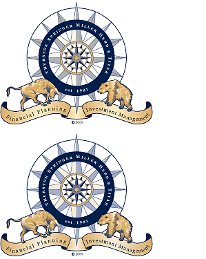
B Plus C Communications analyzed our client Thurston Springer’s logo, which required either four or five spot colors to print, including light gold, dark gold, dark blue, black, and an opaque white ink behind it when it appeared on dark backgrounds. We knew we could lower our client’s printing costs by reducing the number of … Continued …